Visualize Success: 5 Reasons Data Visualization Matters
Posted: May 22, 2024

If you’re like most business owners, you’ve spent hours poring over spreadsheets and reams of data to gain a better understanding of issues that require attention. It can be a daunting process. Data visualization is a powerful tool that transforms all that raw data into insightful visuals – unlocking patterns, trends, and opportunities at a glance.
In this blog post, we’ll unpack the magic and value of data visualization through five key perspectives and offer some practical tips for getting started. Let’s dive into how data visualization can be a game-changer, empowering businesses to thrive in today’s data-driven world!
With more than 50 percent of the brain’s surface being devoted to processing visual information, it is evident that humans are inherently visual creatures. Furthermore, a University of Minnesota study revealed that the human brain processes visuals 60,000 times faster than text. That same study demonstrated that visuals improved learning by up to 400 percent! With these studies in mind, it is no surprise that we humans can spot patterns in visualized data much more efficiently than in text.
Need proof? See for yourself…
In the screenshot below, you will see typical raw sales data by date. Give yourself 10-20 seconds to see what patterns you can identify in this data.

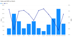
Now, spend 10-20 seconds looking at the below visualization of the previous data set.
Did you notice any difference?
When examining the raw data set, you may have noticed particularly high or low values in certain months, but did you notice the triple-humped seasonality of sales? Or the inverse relationship between sales and gross margin?
When examining the visualized data, the patterns leap out at you with remarkable clarity. It takes very little effort to identify potentially complex patterns that would be almost impossible to notice when reading through raw, text-based, data.
This is why data visualizations are crucial for identifying patterns in data. They leverage the brain’s innate ability to process visual information efficiently, enabling quicker recognition of trends, correlations, and insights that might otherwise go unnoticed in textual or numerical formats.
Beyond highlighting patterns, data visualization offers an opportunity to craft compelling stories that resonate with stakeholders much better than text or numerical data. When the Wharton School of Business compared verbal to visual presentations, they found that half the audience was convinced by the verbal presentation, but that number jumped to over two-thirds when visuals were added. Through visual storytelling, data becomes more than just a collection of numbers—it becomes a narrative that captures attention, evokes emotion, and drives understanding.
Take the example of a company that has come to market with two new products: SKU004, and SKU005.
Spend a moment analyzing the monthly sales data below and reflect on what you notice.
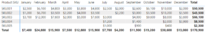
You will find that the performance of the new products is not immediately clear. It takes a minute or two of scanning to realize how the new products faired against the existing product base.
Contrast the numerical data with the visualization seen below.
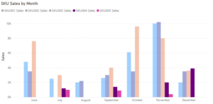
This graph tells the tale of two products navigating the competitive landscape of the market. SKU004 emerges as a success story, steadily gaining momentum and contributing positively to the company’s sales growth. By December, SKU004 has already caught up to the existing product base. Meanwhile, SKU005’s journey highlights the challenges and uncertainties inherent in launching new products.
By simply converting sales by product figures into a visual format, the story behind the product launch and their respective outcomes becomes starkly clear.
Now that we’ve explored how data visualization can reveal patterns and tell stories, let’s shift our focus to the actionable insights that these visuals can provide.
Research conducted by Robert Horn at Standford University revealed that visual language improved problem-solving effectiveness by 19 percent, and produced 22 percent higher results in 13 percent less time. This statistic underscores the value of data visualization in the context of addressing risks and capitalizing on opportunities.
Going back to that company from previous examples, let’s look at another data visualization…
The below visual is called a bubble chart. It features coloured circles imposed over a map of North America. Each bubble emanates from a particular location, with its size being determined by sales volume.
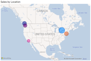
By visualizing sales by location this way, businesses can easily identify geographic sales trends, opportunities for growth, and areas where additional resources may need to be allocated to optimize sales strategies.
Let’s say a company just conducted market research that revealed the addressable market for their products in Los Angeles is larger than that of Toronto. However, sales in Los Angeles (pink bubble) are much lower than that of Toronto (light blue bubble). Knowing this, one glance at the bubble chart reveals a huge opportunity for growth. By shifting or expanding the marketing budget to target Los Angeles more aggressively, this company could significantly increase its sales.
This represents a perfect example of “spotting gold”, but what about “avoiding landmines”?
Take a look at the visual below, showing a pie chart of sales by customer. What is the first thing that you notice?
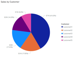
The large dark blue segment of the pie chart should immediately jump out at you. It doesn’t take a data analyst to realize what would happen if this company lost Customer01.
Of course, this landmine could be discovered by observing numerical data, but the visualization makes it impossible to miss. Furthermore, the pie chart provides a visual representation that resonates with the human brain much more effectively than numbers alone.
Data visualization gives decision-makers the confidence they need to make informed decisions. A joint survey conducted by SAS, CIO Marketplace, and IDG Research found that organizations that embraced data visualization saw a 77 percent improvement in company decision-making. Furthermore, Robert Horn at Stanford University revealed that companies that use data visuals can shorten meetings by 24 percent. From these statistics, it becomes evident that harnessing data visualization allows companies to make better decisions in a timelier manner.
Let’s return to the first example of sales and gross margin by month.
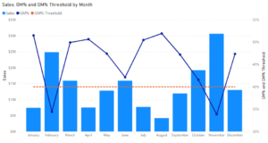
As you can see, a dashed constant line has been added at a gross margin of 40%. This line represents the minimum gross margin that must be achieved to generate an acceptable level of gross profit.
With this addition of a gross margin threshold, decision-makers can easily identify areas where improvements need to be made. For instance, February and November are well below the orange line. This could indicate that the company is discounting its products too aggressively to generate the high levels of sales seen in these months. With this in mind, decision-makers can turn their attention to discounting practices in these months in order to improve margins.
By utilizing data visualization, businesses can clearly and quickly determine what decisions need to be made to address problems and capitalize on opportunities.
Effective communication and collaboration across departments is essential for achieving organizational success. Separate departments must be on the same page in order to align their goals and reach a consensus in decision-making. A study by Stanford University showed that groups using data visualization experienced a 21 percent increase in their ability to reach consensus, compared to groups that did not use visuals.
An effective way to achieve shared understanding is through dashboards (see below visual).
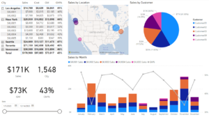
Dashboards consolidate visuals from multiple sources into a single-page snapshot of company performance. They are enhanced by including KPIs (key performance indicators) and comparing actuals to targets. The above dashboard is a simple example of what can be done in less than 10 minutes with the right software (Power BI in this case).
When designing dashboards, it is important to keep in mind the audience that will be using them. For example, when creating a dashboard for a sales representative, you may want to include sales targets by territory, or gross margin goals to guide discounting practices. Alternatively, a product manager may want to see product costing information alongside supplier data. Lastly, to facilitate big picture decision making, the business owner would want a general view of overall company performance indicators alongside their respective targets.
By presenting key metrics and insights in a clear and consistent manner, dashboards facilitate communication, alignment, and collaboration across departments, fostering a shared understanding of organizational goals, performance, and priorities.
Although data visualization can be simple to implement, it is important to adhere to some critical best practices. In this final section, we’ll briefly delve into the factors that can make or break the success of data visualization initiatives.
Define Goals:
It’s essential to define clear objectives and goals for your initiative. Without a clear direction, even the most visually stunning visualizations can fall short of delivering meaningful insights or driving actionable outcomes. By establishing goals upfront, businesses can ensure that their data visualization efforts are purpose-driven, aligning with overarching strategic objectives and maximizing their impact.
Audience:
Defining an audience is often disregarded during data visualization implementation. However, understanding who will need the information to do their job more effectively is paramount to the data’s usefulness. Internally, visualizations can delve deep into intricate details and metrics, assuming a certain level of technical expertise. Conversely, external audiences demand simplicity and clarity, prioritizing insights directly relevant to their needs.
Data Quality:
In the data world, you’ll often hear the phrase “garbage in, garbage out.” This refers to the principle that the quality of the input data significantly impacts the quality of the results generated by any data analysis. That being said, it is absolutely critical to ensure the quality of the data being inputted into your model is of the highest standard.
Live Data:
One of the biggest obstacles to successful data visualization often lies in the time-consuming process of manually updating the model as new data becomes available. This roadblock can be circumvented by implementing a live data model. Utilizing software such as Power BI, businesses can dynamically link their data analysis model to a live database that automatically refreshes on a predefined periodic basis or with the click of a button.
Data visualization isn’t just a tool — it’s a game-changer.
It’s the key to unlocking the untapped potential of your data, revealing insights that can revolutionize the way you do business.
As data visualization becomes an integral part of strategic business management, understanding the value and health of your business through detailed analytics becomes paramount. For business owners preparing for a legacy transition or considering selling their business, a professional Business Valuation is not just a number—it’s a crucial piece of the puzzle that guides decision-making and strategy.
At Rizolve Partners, we specialize in providing comprehensive Business Valuations that help you understand the true worth of your business, empowering you with the knowledge to make informed decisions. Our expertise ensures that your valuation reflects the real potential of your business, aligning with the insights derived from effective data visualization.