As the year comes to a close, business owners are naturally reflecting on the successes and challenges of the past 12 months. With the new year just around the corner, now is the perfect time to take a closer look at one of the most impactful areas of your business: your employees. More specifically, the training and development opportunities you offer to your workforce.
Employee training and development isn’t just about upskilling — it’s about creating an environment where employees feel valued, engaged, and invested. For business owners, this focus pays dividends by retaining top talent, improving productivity, and increasing the overall value of the business. In this blog post, we’ll explore the importance of employee training and development, ask critical questions to evaluate your current approach and discuss how these efforts contribute to your company’s growth and long-term success.
Why Employee Training and Development Matters
Employees are the backbone of your business. When they grow, your company grows. Effective training and development programs do more than enhance employee skills; they foster loyalty, reduce turnover, and contribute to a positive company culture. For business owners, this isn’t just an operational priority — it’s a strategic investment in the future of the business.
Here are some of the key benefits:
Retaining Top Talent: Employees are far more likely to stay with companies that invest in their growth. A report by LinkedIn found that 94% of employees would remain at a company longer if it invested in their career development.
Boosting Productivity: A well-trained workforce is more efficient, productive, and confident in their roles, which translates to better business outcomes.
Attracting High-Caliber Candidates: A reputation for offering strong development opportunities attracts top-tier talent and makes your business a more desirable place to work.
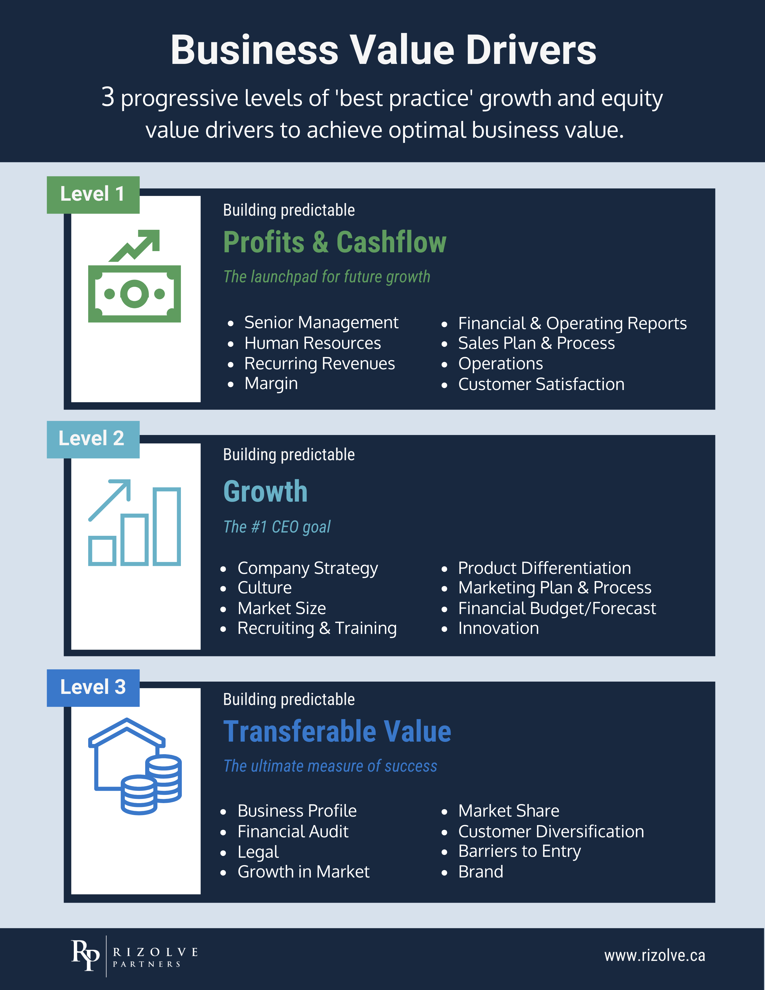
Increasing Business Value: When a business fosters a highly skilled and motivated workforce, it enhances operational efficiency and strengthens its market position, making the company more attractive to potential buyers or investors.
Asking The Right Questions: A Framework For Employee Development
Before implementing or refining your training and development programs, it’s crucial to assess your current efforts. Start by asking these critical questions to identify gaps and opportunities:
1. Do I Have a Clear Vision for My Team’s Development?
Your workforce development strategy should align with your broader business goals. For example, if you’re planning to expand into new markets, do your employees have the skills needed to support this growth? Consider creating a skills roadmap that outlines both current capabilities and future needs.
2. Are Employees Actively Engaged in Their Growth?
Training and development should be a two-way conversation. Regularly check in with employees to understand their career aspirations and identify the skills they want to develop. This fosters a sense of ownership and ensures that training efforts align with both individual and business goals.
3. Are My Training Programs Aligned with Industry Trends?
The business world is constantly evolving, and staying competitive often requires new skills and technologies. Are you providing your employees with training that reflects these changes? Whether it’s digital transformation, leadership development, or customer experience strategies, staying ahead of industry trends ensures your team is prepared for the future.
4. Do I Have the Right Tools and Resources in Place?
Even the best training programs can fall flat without the right infrastructure. Are you leveraging online learning platforms, mentorship programs, or in-house workshops? Consider whether your current tools meet the needs of your employees and your business.
5. Am I Measuring the Impact of Training and Development?
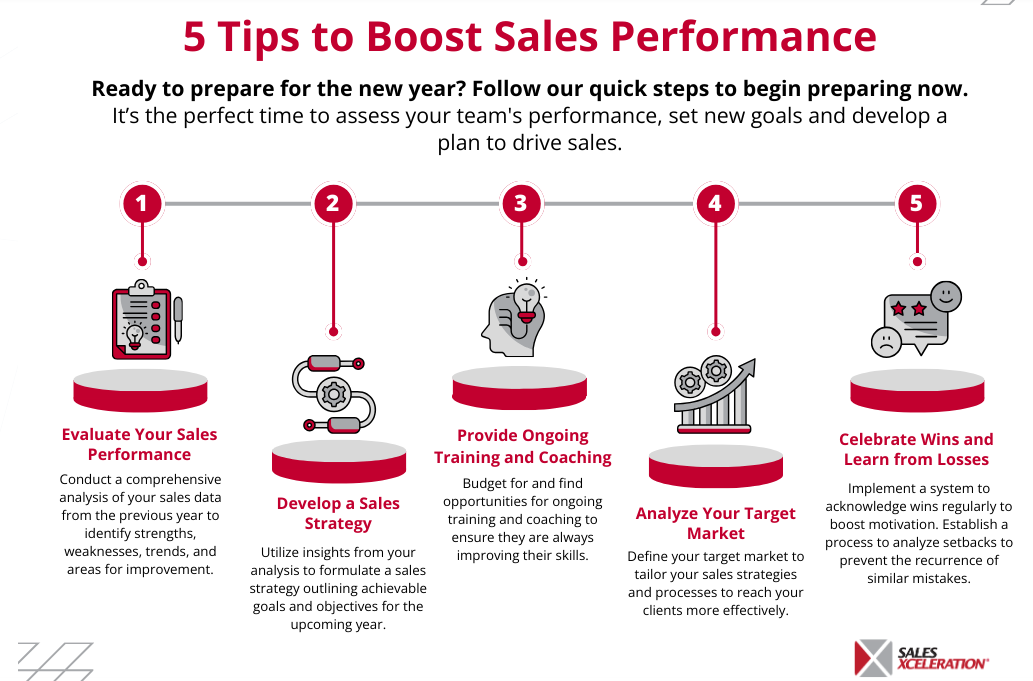
What does success look like for your training efforts? Whether it’s improved employee retention, increased efficiency, or enhanced customer satisfaction, set clear metrics to evaluate the effectiveness of your programs. This allows you to refine and optimize your approach over time.
Implementing Training and Development Programs That Work
Once you’ve evaluated your current efforts, it’s time to take action. Here are some practical steps to implement or improve training and development within your organization:
Start with Onboarding: First impressions matter. A robust onboarding program ensures that new employees feel supported and equipped from day one, setting the tone for their long-term growth.
Create Personalized Development Plans: Recognize that every employee has unique strengths and goals. Work with your team members to create personalized development plans that align with their aspirations and the needs of the business.
Encourage Continuous Learning: Foster a culture of learning by providing access to online courses, industry certifications, or internal workshops. Encourage employees to continuously update their skills to stay competitive.
Invest in Leadership Development: Strong leaders drive strong teams. Identify high-potential employees and offer them leadership training to prepare them for future roles.
Promote Cross-Training Opportunities: Allow employees to explore roles outside of their usual responsibilities. This not only broadens their skill set but also improves team collaboration and resilience.
Employee Development and Business Value: The Connection
For business owners, there’s a clear connection between employee development and business value. A skilled, motivated workforce is a competitive advantage that sets your company apart in the marketplace. It also demonstrates to potential buyers or investors that your business is well-managed and future-ready.
When your team operates effectively, it allows the business to run smoothly, even in your absence — an essential factor in making your business a transferable asset. By investing in employee training and development, you’re not just building a stronger team; you’re increasing the overall value of your company.
Preparing For A Stronger Future
As you plan for the year ahead, consider how your approach to employee training and development fits into your broader business strategy. Are you setting your team — and your business — up for success? By fostering a culture of learning and growth, you’re not only retaining top talent but also positioning your company for long-term resilience and profitability.
At Rizolve Partners, we help business owners create and implement strategies that maximize the potential of their workforce while enhancing the value of their business. If you’re ready to take the next step in developing your team and building a stronger business, reach out to us today.
Contact Rizolve Partners to learn more about how we can help you build business value.


